Bokeh简介
Bokeh是一款交互式可视化库,在浏览器上进行展示。
Bokeh可以通过Python(或其它语言),快速便捷地为大型流数据集提供优雅简洁的高性能交互式图表。

安装
在python中有多种安装Bokeh的方法,这里建议最简单的方法是使用Anaconda Python发行版,然后在命令行下输入以下命令:
conda install bokeh
这里会安装Bokeh需要的所有依赖包,并且Anaconda可以最大限度地减少安装过程的复杂程度。
如果你自信已经安装好需要的依赖,如numpy等,那么可以在命令行使用pip来安装:
pip install bokeh
为什么使用jupyter notebook作为绘图环境
本文代码都是在notebook中执行的,并且图表也直接展示在notebook中。
notebook是用于数据探索的常用工具,在数据科学领域被广泛使用,建议大家在学习Bokeh的过程中使用jupyter notebook。

开始绘图
Bokeh是一个大型库,具有非常多的功能,这里不细讲具体函数方法,只通过一些案例来展示Bokeh的使用流程和可视化界面。
将python列表中的数据绘制成线图非常简单,而且图表是交互式的,能够缩放、平移、保存等其他功能。
图表最终会保存为html格式,并在浏览器中自动打开,这可以通过output_file()函数实现。
如果你使用的是notebook环境,Bokeh可以在notebook中直接显示交互式图表,只要将output_file()函数替换为output_notebook()函数。
# 导入相关库
from bokeh.plotting import figure, output_notebook, show
% matplotlib inline
# 准备数据
x = [1, 2, 3, 4, 5]
y = [6, 7, 2, 4, 5]
# 在notbook中展示
output_notebook()
# 创建一个带有标题和轴标签的新图表
p = figure(title="simple line example", x_axis_label='x', y_axis_label='y')
# 添加带有图例和线条粗细的线图渲染器
#
p.line(x, y, legend="Temp.", line_width=2)
# 显示图表
show(p)
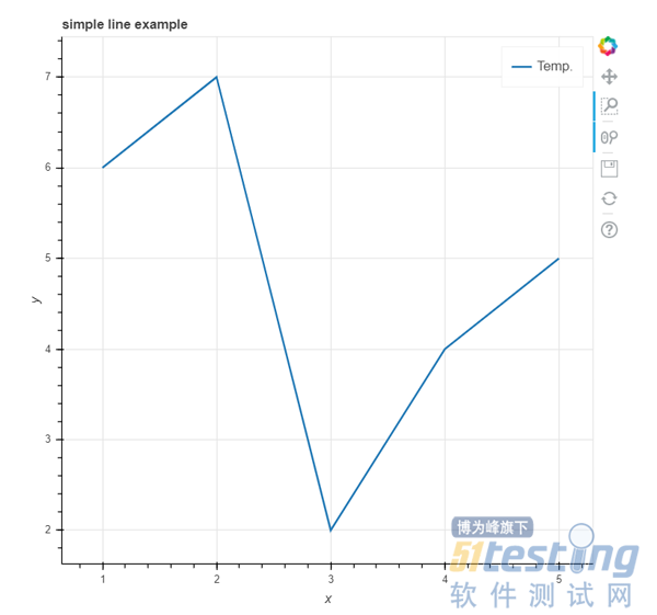
上面的例子绘制了一个折线图,简单地展示了bokeh.plotting模块绘图的流程。
一般来说,我们使用bokeh.plotting模块绘图有以下几个步骤:
· 准备数据
例子中数据容器为列表,你也可以用numpy array、pandas series数据形式
· 告诉Bokeh在哪生成输出图表
上面说过,图表输出有两种形式,一个是在notebook中直接显示,一个是生成HTML文件,在浏览器中自动打开。
· 调用figure()函数
创建具有典型默认选项并易于自定义标题、工具和轴标签的图表
· 添加渲染器
上面使用的是line()线图函数,并且指定了数据源、线条样式、标签等,你也可以使用其他的绘图函数,如点图、柱状图等
· 显示或保存图表
show()函数用来自动打开生成的HTML文件,save()函数用来保存生成的html文件
如果想在一张图里绘制多个数据表,则可以重复上面第4步。
你可以添加多个数据系列,自定义不同的展示风格:
from bokeh.plotting import figure, output_notebook, show
# 准备三个数据系列
x = [0.1, 0.5, 1.0, 1.5, 2.0, 2.5, 3.0]
y0 = [i**2 for i in x]
y1 = [10**i for i in x]
y2 = [10**(i**2) for i in x]
# 在notbook中展示
output_notebook()
# 创建新表
p = figure(
tools="pan,box_zoom,reset,save",
y_axis_type="log", y_range=[0.001, 10**11], title="log axis example",
x_axis_label='sections', y_axis_label='particles'
)
# 添加不同的图表渲染
p.line(x, x, legend="y=x")
p.circle(x, x, legend="y=x", fill_color="white", size=8)
p.line(x, y0, legend="y=x^2", line_width=3)
p.line(x, y1, legend="y=10^x", line_color="red")
p.circle(x, y1, legend="y=10^x", fill_color="red", line_color="red", size=6)
p.line(x, y2, legend="y=10^x^2", line_color="orange", line_dash="4 4")
# 展示图表
show(p)

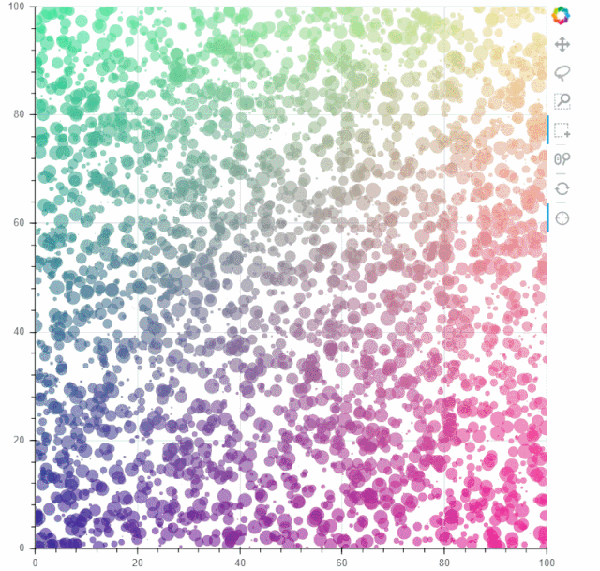
有时候,绘制图表不光要知道数据点在x、y轴的位置,而且要赋予数据点颜色、大小等属性,展示数据点的其它含义,如下:
import numpy as np
from bokeh.plotting import figure, output_file, show
# 准备数据
N = 4000
x = np.random.random(size=N) * 100
y = np.random.random(size=N) * 100
radii = np.random.random(size=N) * 1.5
colors = [
"#%02x%02x%02x" % (int(r), int(g), 150) for r, g in zip(50+2*x, 30+2*y)
]
# 在notbook中展示
output_notebook()
TOOLS = "crosshair,pan,wheel_zoom,box_zoom,reset,box_select,lasso_select"
# 创建图表,并添加图标栏工具
p = figure(tools=TOOLS, x_range=(0, 100), y_range=(0, 100))
# 添加圆绘图渲染函数,并且定义元素的颜色、样式
p.circle(x, y, radius=radii, fill_color=colors, fill_alpha=0.6, line_color=None)
# 显示图表
show(p)
对于同一个数据,可能需要多种展示风格,比如说线、点、圆等,并且把多个图表放在一起,Bokeh能够做到:
import numpy as np
from bokeh.layouts import gridplot
from bokeh.plotting import figure, output_file, show
# 准备数据
N = 100
x = np.linspace(0, 4*np.pi, N)
y0 = np.sin(x)
y1 = np.cos(x)
y2 = np.sin(x) + np.cos(x)
# 在notbook中展示
output_notebook()
# 创建子图表1,元素样式为圆
s1 = figure(width=250, plot_height=250, title=None)
s1.circle(x, y0, size=10, color="navy", alpha=0.5)
# 创建子图表2,元素样式为三角形
s2 = figure(width=250, height=250, x_range=s1.x_range, y_range=s1.y_range, title=None)
s2.triangle(x, y1, size=10, color="firebrick", alpha=0.5)
# 创建子图表3,元素样式为正方形
s3 = figure(width=250, height=250, x_range=s1.x_range, title=None)
s3.square(x, y2, size=10, color="olive", alpha=0.5)
# 将多个子图放到网格图中
p = gridplot([[s1, s2, s3]], toolbar_location=None)
# 显示图表
show(p)

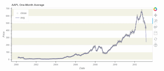
绘制股票价格走势图,这类是关于时间序列的图表:
import numpy as np
from bokeh.plotting import figure, output_file, show
from bokeh.sampledata.stocks import AAPL
# 准备数据
aapl = np.array(AAPL['adj_close'])
aapl_dates = np.array(AAPL['date'], dtype=np.datetime64)
window_size = 30
window = np.ones(window_size)/float(window_size)
aapl_avg = np.convolve(aapl, window, 'same')
# 在notbook中展示
output_notebook()
# 创建新图表
p = figure(plot_width=800, plot_height=350, x_axis_type="datetime")
# 添加图表渲染
p.circle(aapl_dates, aapl, size=4, color='darkgrey', alpha=0.2, legend='close')
p.line(aapl_dates, aapl_avg, color='navy', legend='avg')
# 设置图表元素
p.title.text = "AAPL One-Month Average"
p.legend.location = "top_left"
p.grid.grid_line_alpha = 0
p.xaxis.axis_label = 'Date'
p.yaxis.axis_label = 'Price'
p.ygrid.band_fill_color = "olive"
p.ygrid.band_fill_alpha = 0.1
# 显示图表
show(p)
总结
上述几个示例简单展示了Bokeh绘图方法,希望起到一个抛砖引玉的作用,让大家了解到Bokeh的强大之处,去探索更多的用法。
本文内容不用于商业目的,如涉及知识产权问题,请权利人联系51Testing小编(021-64471599-8017),我们将立即处理