
接下来我们一步步实现以上两个核心模块。
1. 基础表单物料
基础表单物料主要是为了用户选择自定义表单控件使用,我们常用的表单动态渲染有map循环+条件判断和单层map+对象法,前者如果要渲染一个动态表单,可能实现如下:
{
list.map((item, i) => {
return <React.Fragment key={i}>
{
item.type === 'input' && <Input />
}
{
item.type === 'radio' && <Radio />
}
// ...
</React.Fragment>
})
}
但是这样做有个明显的缺点就是会产生很多没必要的判断,如果对于复杂表单,性能往往很低,所以笔者采用后者来实现,复杂度可以降到O(n).我们先来做配置模版:
// 基础模版数据
const tpl = [
{
label: '文本框',
placeholder: '请输入内容',
type: 'text',
value: '',
index: uuid(5)
},
{
label: '单选框',
type: 'radio',
option: [{label: '男', value: 0}, {label: '女', value: 1}],
index: uuid(5)
},
{
label: '复选框',
type: 'checkbox',
option: [{label: '男', value: 0}, {label: '女', value: 1}],
index: uuid(5)
},
{
label: '多行文本',
placeholder: '请输入内容',
type: 'textarea',
index: uuid(5)
},
{
label: '选择框',
placeholder: '请选择',
type: 'select',
option: [{label: '中国', value: 0}, {label: '俄罗斯', value: 1}],
index: uuid(5)
},
{
label: '文件上传',
type: 'upload',
index: uuid(5)
}
]
// 模版渲染组件
const tplMap = {
text: {
component: (props) => {
const { placeholder, label } = props
return <div className={styles.fieldOption}><span className={styles.fieldLabel}>{label}:</span><Input placeholder={placeholder} /></div>
}
},
textarea: {
component: (props) => {
const { placeholder, label } = props
return <div className={styles.fieldOption}><span className={styles.fieldLabel}>{label}:</span><TextArea placeholder={placeholder} /></div>
}
},
radio: {
component: (props) => {
const { option, label } = props
return <div className={styles.fieldOption}>
<span className={styles.fieldLabel}>{label}:</span>
<Radio.Group>
{
option && option.map((item, i) => {
return <Radio style={radioStyle} value={item.value} key={item.label}>
{ item.label }
</Radio>
})
}
</Radio.Group>
</div>
}
},
checkbox: {
component: (props) => {
const { option, label } = props
return <div className={styles.fieldOption}>
<span className={styles.fieldLabel}>{label}:</span>
<Checkbox.Group>
<Row>
{
option && option.map(item => {
return <Col span={16} key={item.label}>
<Checkbox value={item.value} style={{ lineHeight: '32px' }}>
{ item.label }
</Checkbox>
</Col>
})
}
</Row>
</Checkbox.Group>
</div>
}
},
select: {
component: (props) => {
const { placeholder, option, label } = props
return <div className={styles.fieldOption}>
<span className={styles.fieldLabel}>{label}:</span>
<Select placeholder={placeholder} style={{width: '100%'}}>
{
option && option.map(item => {
return <Option value={item.value} key={item.label}>{item.label}</Option>
})
}
</Select>
</div>
}
},
upload: {
component: (props) => {
return <div className={styles.fieldOption}>
<span className={styles.fieldLabel}>{props.label}:</span>
<Upload
listType="picture-card"
className="avatar-uploader"
showUploadList={false}
actinotallow="https://www.mocky.io/v2/5cc8019d300000980a055e76"
>
<div>+</div>
</Upload>
</div>
}
}
}
export {
tpl,
tplMap
}
基础物料在下图所示中使用:

当我们要添加一个表单项时,我们就可以在左边预览操作区看到添加的项,并可以基于表单编辑生成器来编辑表单字段。
2. 表单编辑生成器
表单编辑生成器分为2部分, 第一部分是用来生成表单项的容器组件,封装了添加,删除,编辑操作功能,代码如下:
// 表单容器组件
const BaseFormEl = (props) => {
const {isEdit, onEdit, onDel, onAdd} = props
const handleEdit = (v) => {
onEdit && onEdit(v)
}
return <div className={styles.formControl}>
<div className={styles.formItem}>{ props.children }</div>
<div className={styles.actionBar}>
<span className={styles.actionItem} notallow={onDel}><MinusCircleOutlined /></span>
<span className={styles.actionItem} notallow={onAdd}><PlusCircleOutlined /></span>
<span className={styles.actionItem} notallow={handleEdit}><EditOutlined /></span>
</div>
</div>
}
第二部分主要用来渲染操作区模版,基于BaseFormEl包装不同类型的表单组件, 这里举一个比较复杂的select来说明,其他表单控件类似:
const formMap = {
title: {},
text: {},
textarea: {},
radio: {},
checkbox: {},
select: {
component: (props) => {
const { onDel, onAdd, onEdit, curIndex, index, type, label, placeholder, required, message, option } = props
return <BaseFormEl
notallow={onDel.bind(this, index)}
notallow={onAdd.bind(this, index)}
notallow={onEdit.bind(this, {index, type, placeholder, label, option, required})}
isEdit={curIndex === index}
>
<Form.Item name={label} label={label} rules={[{ message, required }]}>
<Select placeholder={placeholder}>
{
option && option.map(item => {
return <Option value={item.value} key={item.label}>{item.label}</Option>
})
}
</Select>
</Form.Item>
</BaseFormEl>
},
editAttrs: [
{
title: '字段名称',
key: 'label'
},
{
title: '选项',
key: 'option'
},
{
title: '提示文本',
key: 'placeholder'
},
{
title: '是否必填',
key: 'required'
},
]
},
upload: {}
}
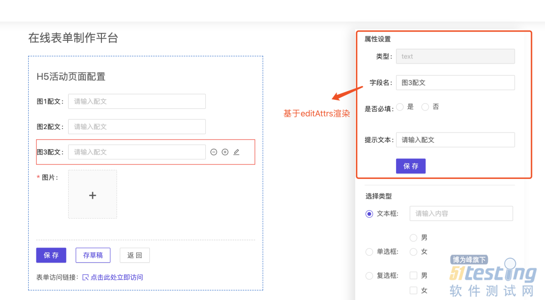
editAttrs主要用来渲染编辑列表,说明哪些表单项可以编辑,这部分代码比较简单,这里直接用图举例:
最后我们来渲染表单生成器组件:
export default (props) => {
const {
formData,
handleDelete,
handleAdd,
handleEdit,
curEditRowIdx
} = props
return <Form name="customForm">
{
formData && formData.map(item => {
let CP = formMap[item.type].component
return <CP {...item} key={item.index}
notallow={handleDelete}
notallow={handleAdd}
notallow={handleEdit}
curIndex={curEditRowIdx}
/>
})
}
</Form>
}
至此,基本功能模块已经开发完成,我们只需要将这些物料和组件导入到编辑页面,基于业务来操作和请求即可。由于实现该案例还是有一定复杂度的,笔者没有将所有组件都一一写出来,希望为大家提供一个思考空间,后续笔者将会把该平台整合到笔者的开源CMS系统中,供大家学习使用。
本文内容不用于商业目的,如涉及知识产权问题,请权利人联系51Testing小编(021-64471599-8017),我们将立即处理


